
41. Pondering the orb
+ zonecore & future past
Hello hello! I turned 32 this month and I’m finally back to a normal rhythm after moving back to France in March. I’ve started looking for a job because freelancing is fun but I also enjoy the stability of a 9 to 5. So if you have any leads for a designer specialised in print, hit me up (or even better send them my portfolio)!
Fresh off the grid
I’m almost done with the initial layout for “100 Dead Heroes”, Rookie Jet Studio’s new game inspired by The Boys. It’ll be reviewed and then potential changes will have to be made. The style we’re going for has forced me to be creative with a lot of constraints and I hope I can show you more next month!
I also started consulting on the layout for “Twisting Unseen”, ChrisAir’s newest MOTHERSHIP module, and this kind of work is always a nice change of pace after spending hours fixing weird spaces between words.
The rest of my time was spent working on projects for Modiphius, but I really can’t say anything about these yet, sorry!
What’s your type(face)?
This month’s theme got me pondering the orb looking for powerful glyphs (browsing the internet for fonts) that could conjure up all matters of spells and hexes (they’re barely legible but look like sigils).
Malebolge: the ridges along the letters make this font look like the sort of hand-drawn letters an obsessive wizard spent too long scribbling on a scroll.
Immortalist: on the other hand, this typeface looks like someone had to write down a spell in a hurry before they forgot about it.
4 Fromages: a typeface where each glyph is made of four versions of the same letter twisted to fit into a square. Once you know this it becomes readable (kind of), otherwise it’s the perfect font to conceal powerful spells.
Jester: this typeface is peak wizardry: it’s a fork of Trickster, which means its glyphs were put through an algorithm to create distorted versions, and it comes with 22 weights (!!!) named after tarot cards. The result is a large collection of characters that look like blots and glitches and are sure to turn your design into a cursed tome.
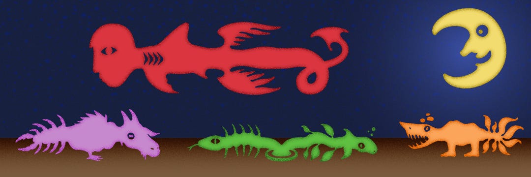
Teranoptia: bonus recommendation! What’s a wizard without a weird familiar? This typeface made of various heads, bodies and tails will let you assemble your perfect chimera.


Creative fuel
In the poll above, if you’re not sure what “zonecore” means, check out this great article from Exeunt Press: “What is Zonecore?”. A lot of the works mentioned are among my favourites books and films, and this gave me ideas for a game where you explore the zone using a mecha…
If you’re a fan of old sci-fi book covers, check out this collection of works by Richard M. Powers. It’s really great to switch between decades and notice trends in the genre.

Wakamai Fondue is a useful tool that lets you check various features and information about a font without having to dig through its files.
I’m happy to report that I completed the 100 Day Project! I managed to do one custom lettering each for 100 consecutive days (had to take a break for a week when I was ill) and now I’m going to pick the ones I like the most and properly design them. Expect to hear more about this in the coming months!


That’s it for this month, thanks for reading!