
39. The ranch aesthetic
+ sincerity in aesthetics
Hello! I’m moving back to France in about 2 weeks, I have a lot to do before that so this post will be short and sweet. Let’s get to it.
Fresh off the grid
I just have one project to show off this month and I want to focus on the references I used and how I incorporated them to design its layout.
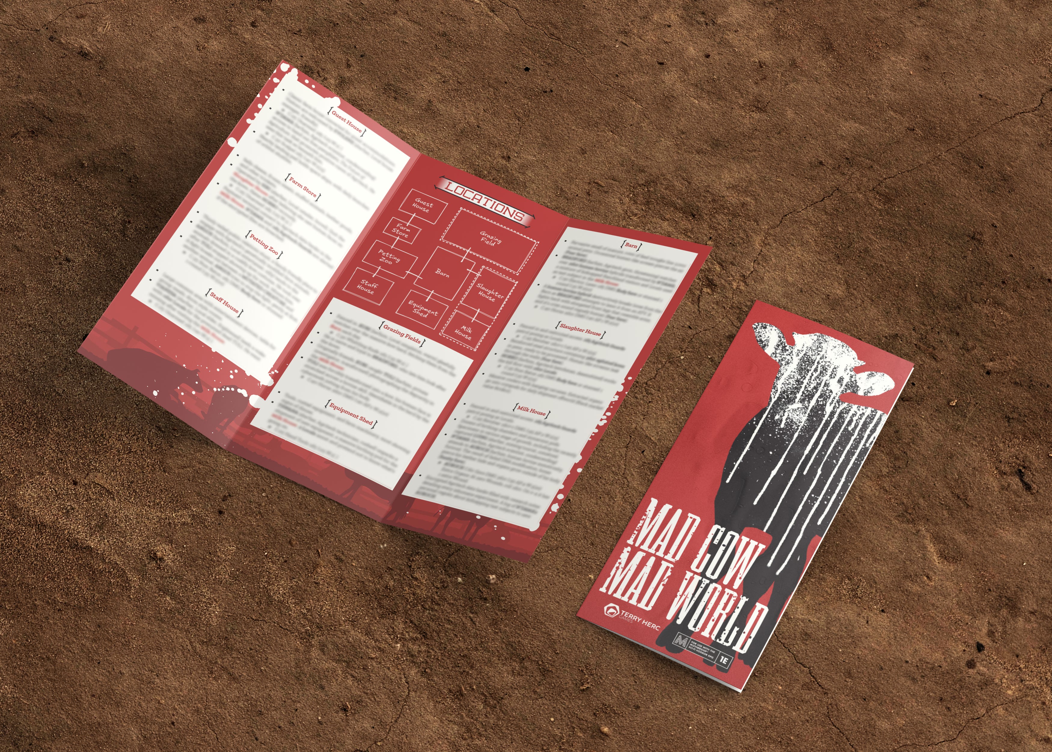
Mad Cow, Mad World by TerryHerc
This scenario for MOTHERSHIP follows the classic “experiments with animals gone wrong” trope but has the originality to take place in a cattle ranch. I liked this brief because it was an opportunity to represent sci-fi horror in a more rural setting than what most adventures do. Gone are the cold metal corridors of space stations, we’re dealing with dusty soil and hay now! I wanted to take advantage of the trifold format to make a sort of advertising leaflet for the ranch. I looked for references and focused on older material because I just can’t resist their charm.
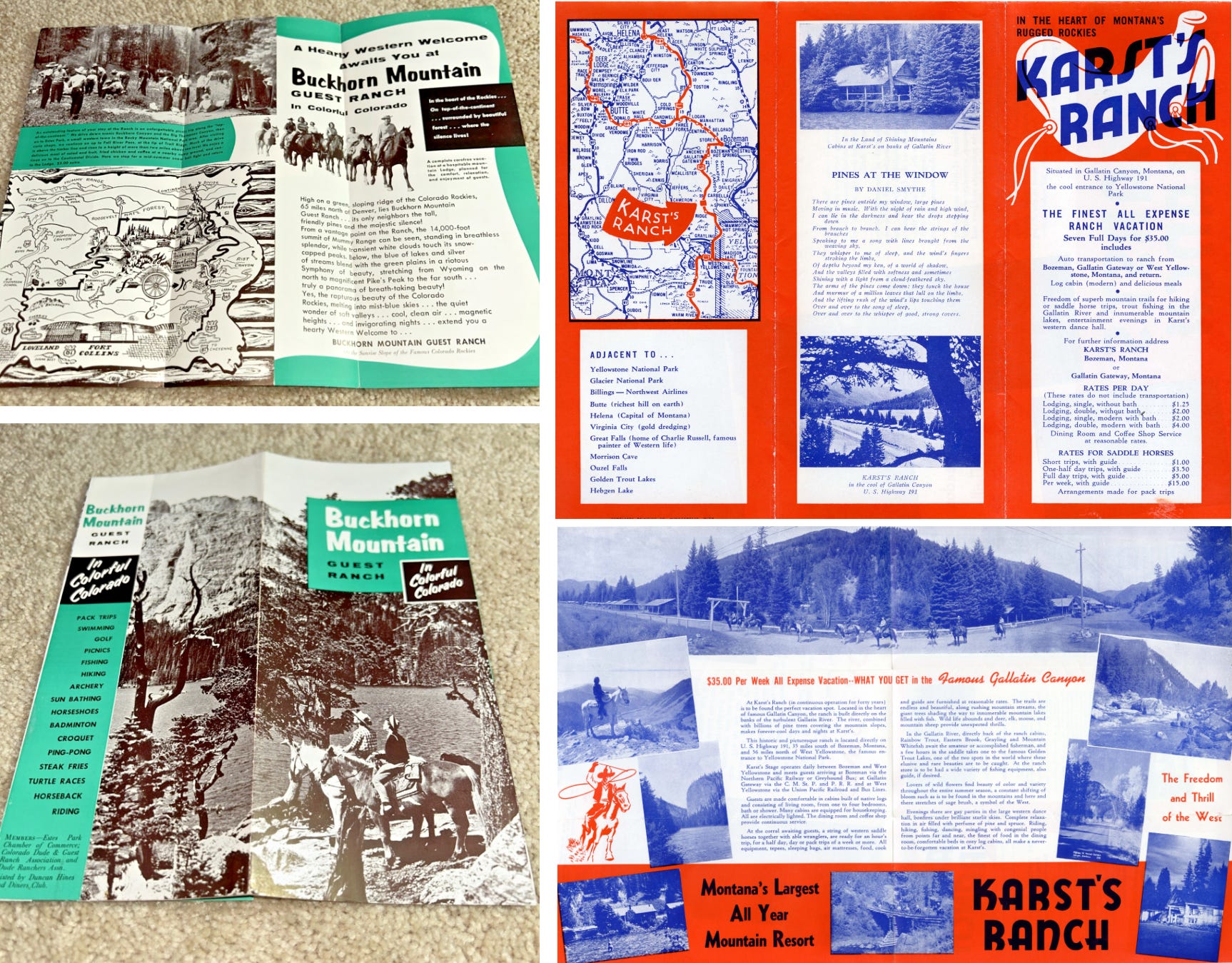
What I took away from these references:
A limited colour palette (you can get away with one colour if it’s bright enough)
Frames with simple shapes to delineate the different sections of the text
A strong iconography (saddle, horse-riding…)
Highlight the landscapes and scenery through the layout
In the brief, Terry mentioned I should use colours that felt reminiscent of farms: red for barns, brown for mud, green for grass... I used a dark red to convey the sense of menace and picked a creamy white to create a soft contrast with the background. I applied this logic to all the other elements of the design:
I tried to make the headers look like neon, futuristic versions of those iron-wrought signs you often find at the entrance of ranches.
The background features a pasture with cows and splatters (but is it milk or blood???).
The cover was an experiment in making a cow scary, and thanks to the magic of textures I think I got there!
If you enjoyed this breakdown, make sure to check out Mad Cow Mad World!
What’s your type(face)?
The theme for this month’s selection, “Punk Xerox”, concerns a landmark in the history of design and politics. Before becoming a suffix attached to any genre of speculative fiction departing from traditional sci-fi, the punk movement stood for values such as “non-conformity, anti-authoritarianism, anti-corporatocracy, a do-it-yourself ethic, anti-consumerist, anti-corporate greed, direct action, and not ‘selling out’”. Naturally the artworks coming from punk artists reflected these ideas not only in their subject but also in the way they were produced and distributed, most notably the use of Xerox machines which made it easy to reproduce and print flyers, posters and zines.1
My usual criteria for these selections are fonts that look nice and are freely available for commercial use. It would have felt dishonest (and not very punk) to only focus on aesthetics for this selection. That’s why I’ve tried to include typefaces, creators and foundries that share similar values.
Gadetyper: this patchwork of a font was made using characters from signs and graffitis found on the streets of Copenhagen, which makes it naturally gritty and eye-catching
Anarchist Mustache: one of many typefaces designed by Loki Gwynbleidd, an “angry anarcho-vintage artist” whose work is inspired by posters, flyers and designs from the 19th and early 20th centuries.
Publifluor: this typeface is based on the work of self-taught letterer Chrystel Crickx, who used to cut out letters by hand for signage and sold them in her store Publi Fluor. This version includes many glyphs for gender-neutral language (“écriture inclusive” in French).2
Lettuce’s Ransom Text: not a font but more of a tool to recreate the gritty analog look and feel of punk designs. Each letter comes with several options (all the serif, sans and slab you’ll need) so you can easily avoid repetitions.


Creative fuel
Speaking of punk, the work of Corita Kent is a powerful reminder of how graphic design goes beyond visual problem solving: “Her work insists that design is not decoration. It is a tool for seeing, for staying engaged. Corita Kent did not make gentle art for comfortable people. It’s hard-hitting art, for hard-hit people.”

Love the work of Pedro Stolf whose goal is to make “sci-fi queer, exciting and human-oriented again”.

A fantastic thread about some of the ideas behind the visual design of the upcoming game Blades ‘68.
Elizabeth Goodspeed wrote, once again, a great article dissecting a current trend of graphic design: faking analogue techniques! As a designer I’ve always been attracted to the grittiness and imperfections of print matter. And like many other designers I’ve tried to recreate these elements digitally, mostly to save time. But the point of the article is not to blame designers who can’t afford the time to work with analogue techniques, but rather the lack of conditions that could create the space for it. Ironically, these processes seem to be slowly becoming more and more popular as a sign of authenticity against AI-generated assets: “What matters isn’t how convincingly something performs imperfection, but whether we can create conditions where imperfection still matters.”
Jules Vernacular is project cataloguing typography from signs all across France, and I absolutely adore it.
The 100 Day Project is still going strong! I have started polishing some of my designs but haven’t taken the time to post them yet. In the meantime, here are some favourites from last month. (as I post this I realise the D in “Warlord” is too short, which is why I need to rework these before posting them properly)


That’s it for this month, thanks for reading!
Quote and info from Wikipedia.
All the fonts available on Bye Bye Binary can be downloaded “for free” but a donation is expected if you use them commercially. The amount depends on the project and structure they’ll be used for so make sure to check their terms to learn more about it.