
Hello! First post written from Japan, as I moved here a couple of weeks ago. Jetlag wasn’t too bad, my fiancée and I are pretty much done settling in our new place and now we’re back to building a new routine together. And that routine includes writing News from the Grid, so onwards!
Fresh off the grid
First thoughts on working with Modiphius
Work is still going on with Modiphius, and while I can’t show yet what I’m working on, I want to share some personal insight.
I’m used to working with independent creators who most of the time are publishing a module or game as a hobby which means some things are figured out as we go. This is not a problem as the production process tends to only involve a handful of people and any issue can usually be fixed with a couple of Discord messages. Modiphius being a well-established publisher with games covering various IPs, I expected a completely different workflow. There is obviously a lot more structure and the overall production process is very organised with clearly defined steps, just because of the scale at which they operate. This was very intimidating to me, as I was worried any question I would ask would be perceived as a lack of professional acumen, which could then mean I would not be hired for future projects. But I was very wrong. So far all my questions and comments have been met with positive responses and consideration, and not at a single moment have I felt like anything I asked was redundant or hindering production, quite the opposite. Of course this is in part due to the team I’m working with, but who knew clear communication could work so well? Me but I worry too much and tend to forget the obvious.
Hopefully I can be more specific about the design part of the project soon!
Information design for “Outer Rim: Uprising - Campaign Handbook”
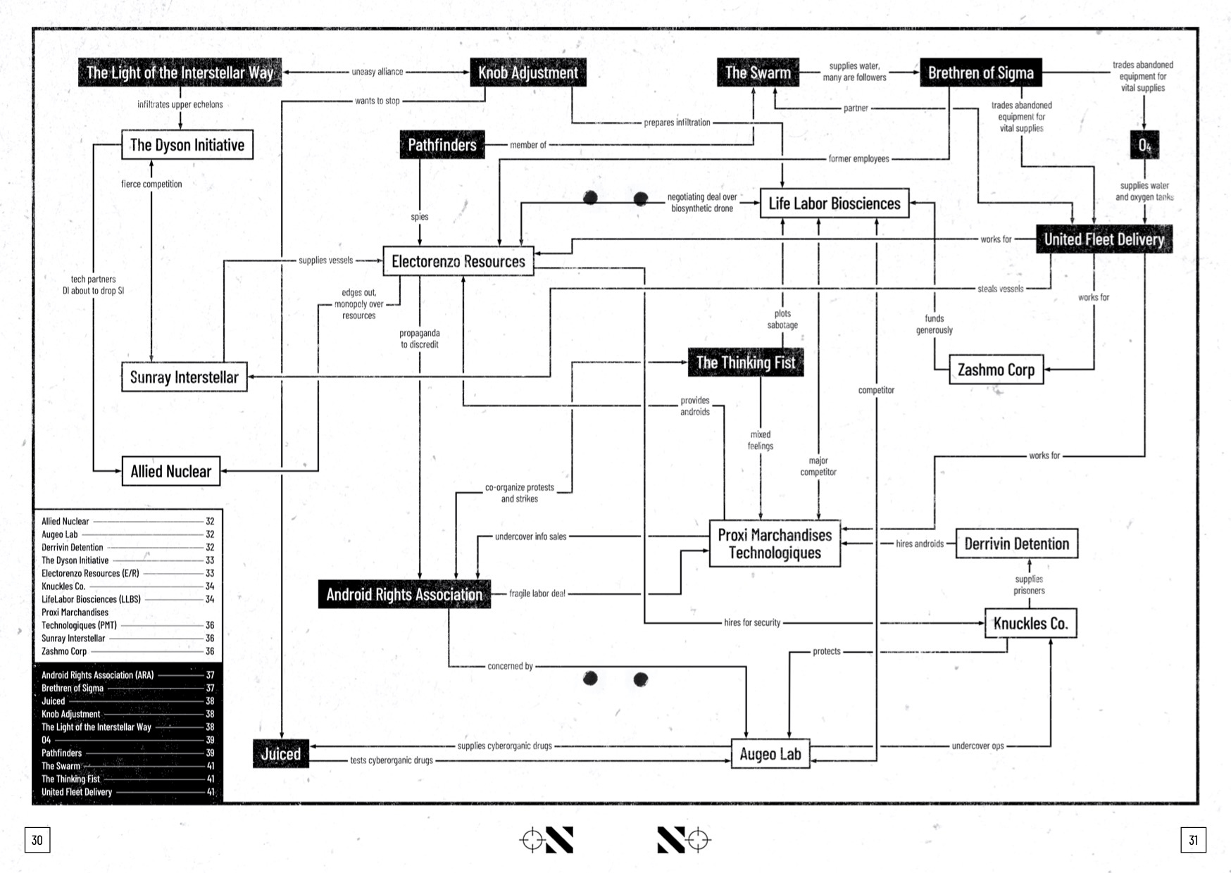
Remember when I said the Campaign Handbook was almost done? Well I kinda forgot I still had to make a whole map, faction diagram and wait for additional art. The map still needs a bit of tweaking so for now I’ll focus on the faction diagram. Iko wanted to include a relationship map that would detail how each faction present in the Outer Rim bundle interacts with the others. And it’s a great tool to have as a GM so I was excited to design such a useful piece. But when I saw Iko’s rough version I realised how challenging it would be: 20 factions, split into 2 groups, all with complex relationships with each other (meaning simple arrows and symbols would be no use), all that in black and white and fit on an A5 spread.
The aesthetic of the handbook being based in DIY, grungy punk zines, my first idea was to make it like a handwritten diagram with scribbled notes. But given the amount of info it contains, this approach would reach its limit very quickly (this reasoning is the same I had when working on the headers). So instead I looked towards something more industrial, more corporate: straight lines and boxed entities were the way to go.

But as you can see below, my chart is much less straightforward than one entity at the top branching into smaller ones. Mine has arrows going all over the place, back and forth, crossing each other and even across the spread (those were the worst to figure out). The main trick I used to make it work was to add a second stroke behind the main stroke of the arrows, which would break other arrows when it crossed them and make it easier to follow where they’re all going. Then it was mostly a game of figuring out which entities were the biggest knots (the ones with the most connections) and placing the smaller entities while connecting them. This worked so well that I was even able to work in a table with page references for each faction!
Bonus: print test of the zine with one of my favourite spreads!
What’s your type(face)?
Solarpunk is an artistic and literary movement focusing on creating a sustainable future built around nature and community.1 In regards to design and typography, I interpreted this as finding new ways to create, ones that would feel more connected with nature, whether as an inspiration or even a participant in design (which is why the specimens have a very green-oriented colour palette).
Plantasia Stingray: this typeface is part of a project where students had to design typefaces based on plants that were then assembled to form a superfamily of organic typefaces. This one is Stingray but I also really like Arbo and Pilea Peper.
Stigmate: a typeface inspired by graffitis found on trees (hence the almost complete lack of curves).
Occlusion Grotesque: a typeface grown on a tree. More exactly, the letters were carved on a tree and photographed over several years, thus creating 5 different weights. I highly encourage you read the process for more information.
Museo Moderno: this was developed for the Museum of Modern Art of Buenos Aires, which is itself very solarpunk. Its curves and round angles convey the hopefulness of the solarpunk movement.


Creative fuel
I found out about Márton Tóth’s fantastic designs and I just love his mix of texture and ethereal fantasy. More about him here.

The Alphabet Superset challenge continues with D, E, F and G. I went the analogue route for the D and E entries (The Drums’ eponymous album and “An Ever Changing View” by Matthew Halsall): the first one is made of cutouts that I scanned and assembled, and the second has some of its pages printed on tracing paper. I made a flip-through video because I was super happy with the result. For the other two I stuck to digital but with very different styles: classic crooner with modern touches and poetically abstract. I’m still having a lot of fun with this and I want to try more analogue techniques for future entries.


It did not take me long to buy a graphic design-related book in Japan, and my first purchase was this collection of cool typography filled with inspiration.


That’s it for this month, thanks for reading!