


24. Wrap ups and onboardings
+ clickety keyboards, taglines and braids

My schedule for next year is open so if you need a cool poster, an eye-catching cover or a great layout for a book, check out my portfolio and don’t hesitate to reach out!
Phew what a month! I’ve been quite busy the past few weeks, both with personal and professional matters, which is probably a good way to warm up for the Christmas season. I’ll be at Dragonmeet this weekend, so if you see me come and say hi 👋
I’ve been working on…
I’ve been wrapping up projects and onboarding new ones, so that means there’s not much to show yet! I’ve also been thinking about some changes to bring to News from the Grid next year, so stay tuned for more info on all that soon…
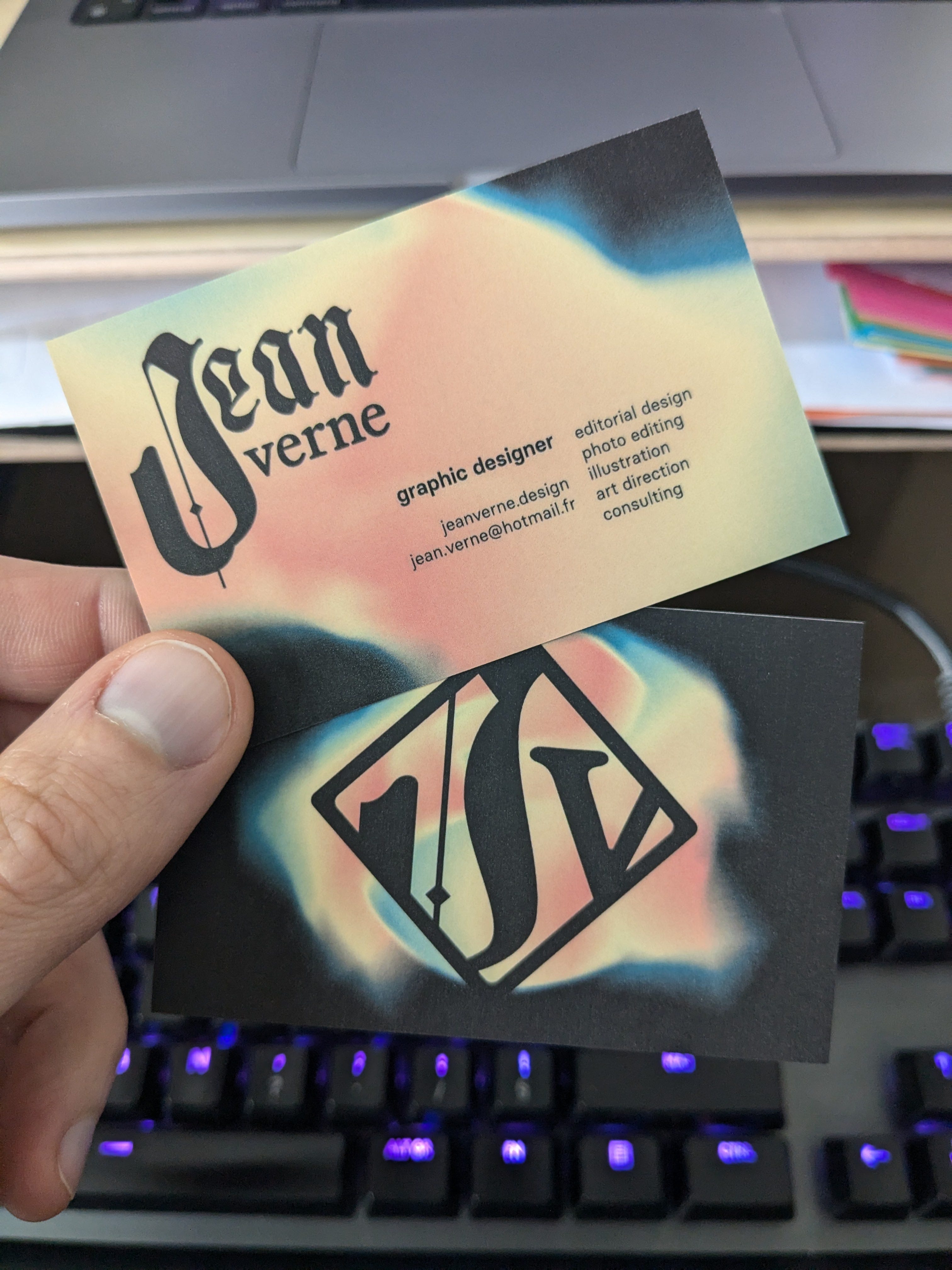
I also made a new business card because the old one linked to my Twitter account so I limited the contact info to email address and portfolio only.
Cool free fonts for your cool projects
The winner of last month’s poll was “In space no one can hear you type”. A nod to the iconic tagline from the first Alien film, I picked typefaces that embodied this lo-fi tech, blue collar, “clickety keyboard and CRT screen” aesthetic.
VT323: this theme just screams “mono pixelated font”. Also I like how narrow this typeface is despite it being mono.
Hyperjump: a great sans serif with multiple weights and just enough flair to feel sci-fi while still remaining legible
Mainframe and Unicephalon: designed by Disasterfonts (whom I’ve featured in this newsletter before) these typefaces are perfect to evoke kitschy and outdated industrial interfaces.


The entries for next month’s poll are all entries that were not picked previously but that I’d love to find fonts for. Also because I’m taking some time off in December, this selection will only be showcased in January next year, sorry!
At leisure
As I said in the intro, I was quite busy this month, so I didn’t have much time for personal projects. But I watched a few films and here are my highlights.
Thief by Michael Mann (who directed Heat and Collateral, which I also adore) tells the story of a thief trying to leave his life of crime to build a family. The film is incredibly stylised, most notably during the night scenes where everything is drenched in blue hues, especially the main character. In many aspects it reminded of Drive, specifically in how it portrays the city. The screenshot below is what convinced me to watch the film, I mean look at that bokeh in the background!
![Thief [DERNIÈRE SÉANCE] - Cinéma Moderne](https://substackcdn.com/image/fetch/$s_!aydh!,f_auto,q_auto:good,fl_progressive:steep/https%3A%2F%2Fsubstack-post-media.s3.amazonaws.com%2Fpublic%2Fimages%2Fc43da7a3-7049-4659-a573-2f1f37a5d9ea_1200x675.jpeg "Thief [DERNIÈRE SÉANCE] - Cinéma Moderne")
I also watched Out of Sight by Steven Soderbergh. As a big fan of the Ocean’s trilogy, I was very curious about an earlier heist film from the same director. And unsurprisingly it features a lot of similar elements: George Clooney’s charisma, freeze frames that act as transitions between scenes, “natural” staging and lighting… It’s more of a romantic comedy than a heist film but it was still very enjoyable thanks to the great cast: Jennifer Lopez, Ving Rhames and Don Cheadle among others.
Finally I watched Ridley Scott’s first film, The Duellists. This one had been on my list for a while, first of all because of its amazing poster (this 3-sentence tagline is honestly incredible).
 - IMDb")
The story is about two hussards, who keep duelling each other, because one of them is obsessed with duelling and the other because he’s just very unlucky. The plot sometimes feels incredibly comedic as the characters bump into each other in random places in Europe over 20 years, but it’s presented in an interesting way, with the fall of the First Empire used as a backdrop. The film is beautifully shot and feels like a series of paintings. The costumes look fantastic (based on my limited knowledge of the period) and made me want to grow my hair again so I can rock the same awesome braids as the hussards.

That’s it for this month, thanks for reading and see you soon!