

7. Summer fun

Hello everyone! June was a very full month, with lots of varied projects I’m excited to tell you about. Let’s dive in!
I’ve been working on…
First of all, in the last post I mentioned the upcoming release of Rider Konchu by Cave of Monster Games, a game inspired by TV shows such as Kamen Rider and it’s finally out!

It’s a really fun game with amazing art so if you’re into highly-choreographed fights and captivating drama, check it out!
Elements of Procedure, by Cave of Monsters Games
Yep we’re already working on a new project together! After mask-wearing fighters we’re moving to the realms of early 80s supernatural events and science-fiction. Element of Procedure is inspired by the TV show Sapphire & Steel, and puts players in the shoes of Operatives, humans who gave up their humanity and were granted powers to help preserve the flow of time. It features great art by Ray Bruwelheide. Because of its inspiration, I wanted to go full retro for the layout, and make the book look like an instruction manual for those Operatives. What does that mean? Justified text, a chunky, all caps, cut-out-like header font and a classic but stylish sans serif for the body text (look at those bevelled ascents). I also added a personal favourite of mine, dividers, pretty much everywhere I could (and because it made sense given the aesthetic of the book). A baseline grid was also an obvious choice, but my previous experiences using one had all felt very constraining and limiting. But after spending some time looking at Clayton Notestine’s Classic Explorer Template, I understood what made a good grid work and how to use it efficiently. You can see from the image below that the baseline grid creates a great rhythm and helps create a structure to the layout, making it more logical to follow.
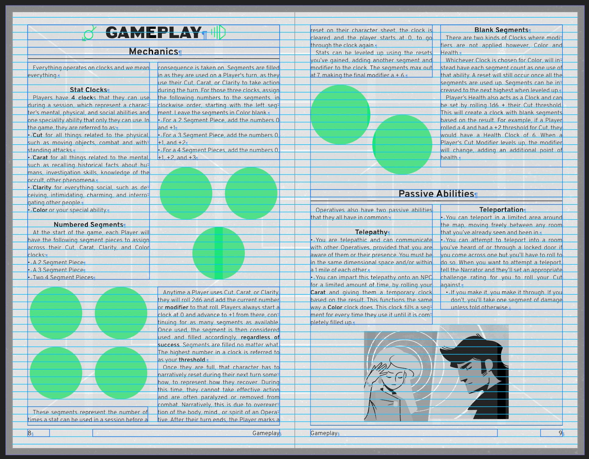
It also improves the layout process as I can instantly snap text or image frames to it without having to nudge them by a few pixels to make sure it all aligns. Additionnally interesting, this project will be printed in riso (yaaaay!). Risograph is a process where each colour is printed separately on top of each other (instead of mixing cyan, magenta, yellow and black) which creates images with limited palettes and vibrant colours. For this we’ll be working with the amazing people at Secret Room Press. We just had a meeting yesterday to discuss the project and John James and Cielle are very capable and passionate, so I’m really glad to work with them.
Blackgrove, by Matthew Kubilis
New project happening! It’s still very early in the process so I can’t show you anything yet, but this game is “a modern, urban fantasy setting with an alternate history where monsters live in hiding from humans”. Matthew mentioned he wanted the book to look like a report with bits of information scattered on notes and photos, to make it look a folder filled with information. I love this kind of prop-making job, so I’m very excited to dive deeper into Blackgrove.
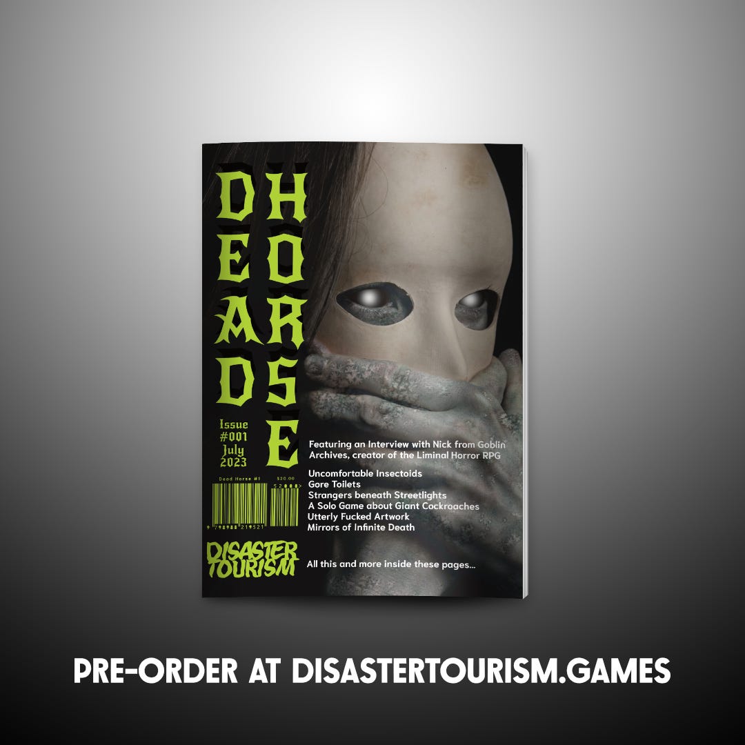
And now for two very exciting announcements! First is Dead Horse issue 1. I had submitted the FACES Art Pack I released earlier this year, and I guess the team really liked them because they asked me to make a new one for the cover. Dead Horse is a zine about anything horror: art, fiction, essays and games from many talented creators. The theme for this first issue is unsettling horror, and if you’re into that kind of things preorders are open until July 7th so hurry up!
Amusing side note: I can’t watch horror films, I get too scared.
Second cool annoucement is the Outer Rim: Uprising bundle! If you follow Iko’s newsletter, The Dispatch, you probably already know what this is. But if you don’t, Outer Rim: Uprising is a bundle for Mothership filled to the brim with content to help you run everything from one-shots to year-long campaigns. Character classes, modules, rules and a lot more from a bunch of seasoned Mothership creators. Plus the bundle is themed around revolution and fighting big corpos, so that ought to be fun. I’ll be doing the layout for Iko’s entries, and we have some previews to show you soon, so make sure to follow The Dispatch if you want to see those. More info about the bundle below:

Cool (free) fonts
Brockmann - This sans serif is inspired by none other than Josef Müller-Brockmann, a Swiss graphic designer and member of the International Typographic Style. But most importantly, he wrote Grid Systems, the reference book on how to use grids in layout. The font is angular and elegant, and encapsulates the characteristics of the Swiss style (clean lines, timeless design) through a modern lens. A basic version is available as pay-what-you-want and the complete family can be bought for a very affordable price.
Spacelander - Can I go one post without recommending a sci-fi adjacent font? Probably not but I’m trying. This font is borderline unreadable but looks great as techno gibberish to put on an alien poster.
Peter Obscure - What I love about this font is that despite having a lot of personality, it doesn’t feel constrained to one genre or aesthetic: steampunk, noir, sci-fantasy, weird west… Gotta love versatility!
When I don’t work…
I recently found a copy of Understanding Typography by Ellen Lupton at a second-hand bookstore. I’ve seen this book recommended on several lists and by many designers as an essential for anyone interested in typography, so I can’t wait to get into it.
I also started reading The Five Star Stories, a manga about god-like emperors and mechas with extremely convoluted designs. The first volume came out in 1986 and the story is still going, but the author is taking his time so there are only 16 volumes out so far. The manga does show its age in its art style and storytelling but it still works thanks to a detailed and engaging worldbuilding. The book even includes a timeline of the whole history of the realms, which spoils future volumes. But to the author, the point is not the end of the story (which is actually shown as the prologue), but the process which led us there. And honestly that process is hella fun.
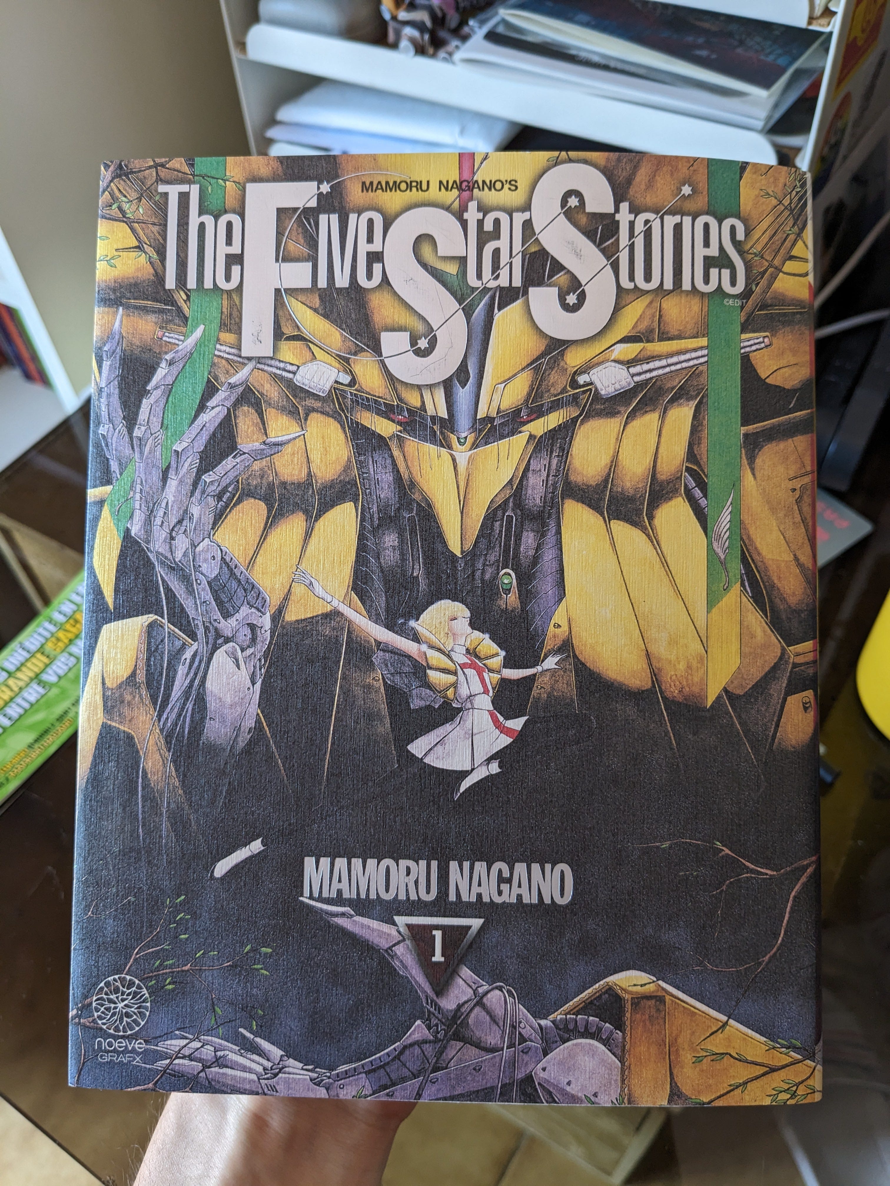
Look at this textured cover! The title is embossed and with a foil!!! Finally I’ve been watching Final Space, which feels like a less obnoxious version of Rick and Morty. Everything in the show is thematically linked to solitude, which might make it seem too focused, but each character experiences it in a very specific way, which keeps things interesting episode after episode.
And that’s it for today! Thanks for reading, I’ll see you next month!
You'll have to let me know what you think of Understanding Typography by Ellen Lupton. I've recommended it in the past, but it hasn't resurfaced on my re-read list yet.
And I love that you love Brockmann. A beautiful typeface inspired by our patron saint of grid design.