


1. Retro inspiration
Where I overuse the word "retro"

Time for the first actual post! The previous was more of an introduction about who I am and what to expect from this newsletter, but this one has got some interesting stuff, promise!
I’ve been working on…
Hoss, written by Tim Obermueller.
I was tasked with making a spread of the timeline for Tim’s next Mothership module, Hoss. Timelines are always interesting to me because they’re a great way to convey factual and thematic information. So for this one I tried to go for an archival look, I tried to imagine how a newspaper or museum would display such information.
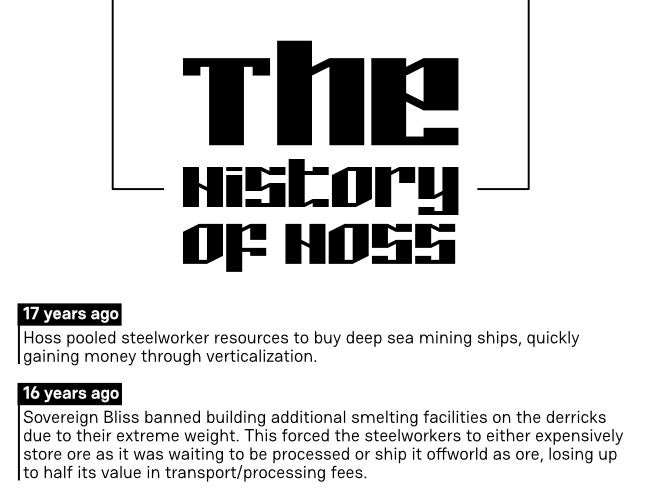
Tim’s known for Mothership modules such as “The Burning of Carbex”, “The House Always Wins” and the recent “Curse of The Hat Man”.
In his brief, Tim described Hoss as inspired “by American Unions/gangs, the Cuban Revolution and the Yakuza”. So there’s a clear idea of class struggle and solidarity among the oppressed. I’ve only worked on a preview spread and the rest of the module is still being written, but this promises to be a very interesting adventure.
Welcome to Astral Brews, written by Joel Hines.
Another Mothership module, with a fun premise. What if, instead of being hired to explore a hostile planet, face deadly aliens and the horrors of space, players simply started working at space Starbucks?
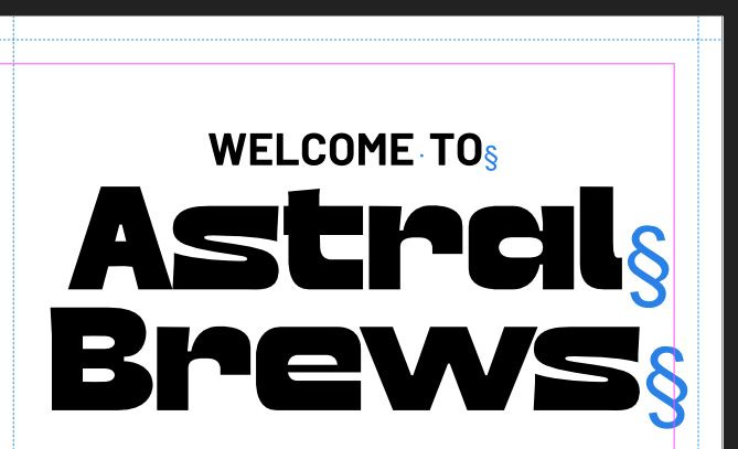
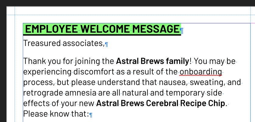
This one is a brochure, and I love brochures! They are a great way to practice concise writing and efficient design. And there’s also so much you can do with folds. You have to decide which info is going to be presented first (left inside panel), what is most important and needs to be presented on the interior; what is dispensable enough that it can be on the centre back panel (the least accessible one) and what is useful but not capital to run the module (placed on the outside and accessible by folding the right panel). So it’s fair to say I’m having a lot of fun designing this one.
Overall I’m very excited to work on these two projects
Inspiration
typography exhibition
current inspiration: CY_BORG module, Rivières Pourpres
Cool fonts
Vinston: This one was made for sci-fi display, and it makes me want to create fake mecha piloting interface.
Selant: A fun font that would look perfect in a retro sci-fi project.
Olivetti Neue: I love its retro look, and the inspiration being old Italian typewriter characters is the kind of niche I love in font design.
Lots of retro fonts here, I’ll try to be more modern next time!
Newsletter ring
And I’ll be at Dragonmeet! I’ll be there to meet friends from Twitter or Discord so that’s going to be fun. If you’re there and find me, come say hi :)