

15. Back to business

Hello everyone! Design work has started again and so we’re back to our regular schedule of monthly updates. Let’s get into it!
I’ve been working on…
Tacticians of Ahm, by MeatCastle GameWare
First client project of the year and it’s a big one! Tacticians of Ahm is a tactical roleplaying game inspired by JRPG (think Final Fantasy Tactics). Its visual influences pixel graphics and the aesthetic of retro video games. So of course the book has to look like a video game manual: a strong colour palette based on the existing artwork, diagrams and charts, boxed text and graphics and finally mixing sans serif for rules with serif for flavour text. The original version of the layout had a pixel typeface for the header but I found it a little hard to read at smaller sizes so I replaced it with a taller and modern interpretation of that.


As you can see in the screenshots above, I used a 4-columns grid to have some flexibility in the way I place the text and graphics. The baseline grid is also here to help me maintain a consistent spacing between all these elements. This setup makes it very easy to balance all these moving parts.
The game is itchfunding right now, and the money raised will go towards commissioning more art, paying for editing and hiring me to do the full layout. So if you’re interested, go check out the game and support it now!
Dreamlands, by the Good Sleep Collective
New project from the Good Sleep Collective, a group of Europe-based creators I’ve been part of for a few years now. We usually help each other with our various projects but every now and then we band together to make something awesome! Our late participation for Zimo is Dreamlands, a zine about the citizens and perils that await adventurers when they fall asleep. In it you will find a collection of classes, monsters, encounters and more for DURF. The Hat Man spread below is written by Wendy Pixel Curatrix and features art by Strega Wolf, and the Oneiromancer is written and illustrated by Emiel Boven.


Since we’re only making this a digital release, we’re doing everything to make it as easy to read as possible. Which means that the serif we first picked for the body text was replaced by a sans serif and that we’re keeping it simple for the layout, with a two-columns layout and illustrations and graphics that don’t get in the way of the body text. We just started itchfunding the project, so if you want to wander in the dreams and nightmares of your adventurers, go check it out now!
Cool free fonts
Cucurucho: a handwritten typeface with elegant curves and sharp angles. It only has caps but offers two different weights you can use to balance your designs.
Grainy: this typeface’s design is inspired by grain (smart isn’t it?) but I thought it gave off some sort of cyberpunk or slick sci-fi vibe.
The Ultimate Oldschool PC Font Pack: in my research for the layout of Tacticians of Ahm, I went back to the source of the fonts used on the cover of the game and found some more gems! Based on bitmap typefaces from old computers, this website is a treasure trove for amateurs of pixelated graphics. The ones featured here are HP 100LX 6x12 and CL Stingray 8x19, but there’s a ton more.

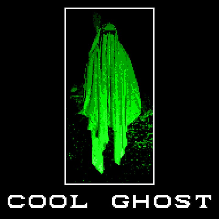
Left to right, top to bottom: Cucurucho, Grainy, HP 100LX 16x12, CL Stingray 8x19


When I don’t work…
As you may have guessed from my previous newsletter, this year I’m getting back into manga and anime. And after catching up on the Jujutsu Kaisen manga, I started reading Dungeon Meshi and Ajin. I had read about Dungeon Meshi on social media, as people praised the series for its positive and interesting message as well as its visual style, so when I saw it on Netflix I gave it a chance. The first episode got me hooked! Telling the story of a group of adventurers who explore the depths of a dungeon while eating its monsters to survive, each scene feels like a TTRPG night with friends, as the characters come up with ridiculous plans to satisfy their strange but endearing obsessions. I picked up the manga because the weekly episodes weren’t enough for me!

I also devoured the 83 chapters of Ajin, a story about demi-humans, people who reset their bodies whenever they die and are thus invincible. The plot is much more cerebral than I anticipated, with the story being more about showing how this strange power works and characters using it in more and more impressive ways. Its main antagonist is particularly fun to follow for the constant ingenuity with which he uses his power.
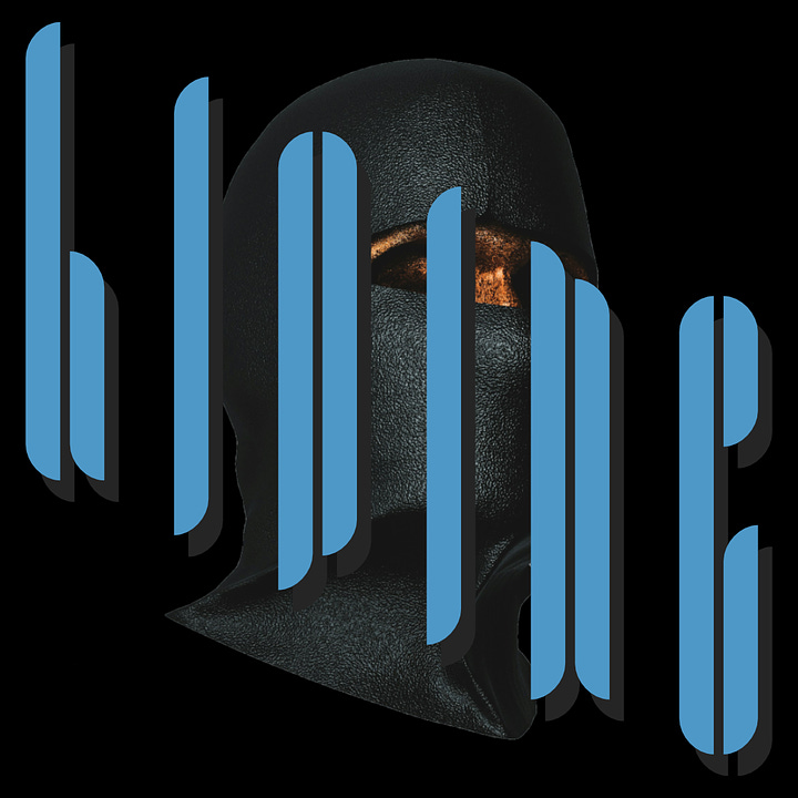
And finally here are the Alphabet Superset designs for this month: ram-dao, szabla and targe. The ram-dao poster is something I’ve wanted to make since I started this challenge, so I’m very glad I finally found the subject for it. The other two were some fun experiments in form with the szabla being inspired by retro computer aesthetics and the targe one being more like a 70s ad.


That’s it for this month, thanks for reading and see you next time!
That game manuel art is fantastic and very nostalgic. It reminds me of how I would lay in bed thumbing through my Streets of Rage manual.
I was like "Ooo, that Cool Ghost font is so cool - I need to go grab that" and only then read and saw that it's from the pack I already have (some of which I've used all the time). lol