

19. Short but sweet

Hello everyone! The heat is exhausting so this will be a short one.
I’ve been working on…
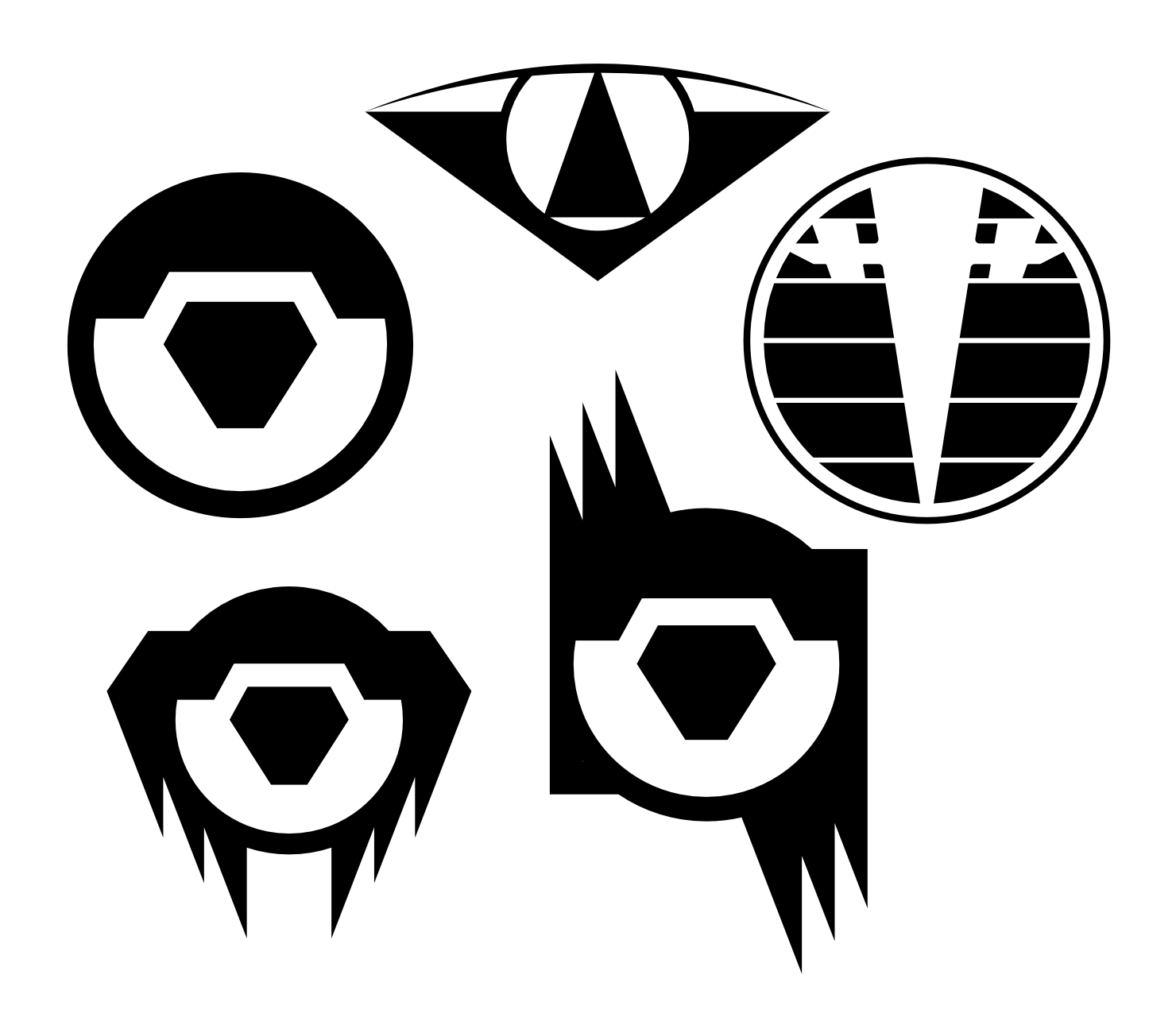
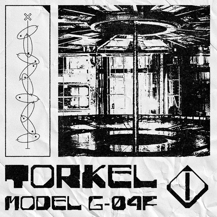
Twisting Unseen, by ChrisAir
Work on Chris’ new project is going strong, and this time I can show it off! This adventure for Mothership features several factions for which Chris wanted me to design icons. Here you can see some of the options I put together for the Shawl, a militia in charge of maintaining the authority of another faction: an eye shape for the idea of surveillance and pointy angles to make it menacing. The final version is in here somewhere…
Encounter template for GRANDMOTHERSHIP, by Armanda Haller
I wrote a tutorial to use the template, and Armanda is now reviewing it, so it should be available very soon!
Sell sheets for SoulMuppet Publishing
The lovely people at SoulMuppet reached out to ask me to design a catalogue and sell sheets for their future release of the year. As a designer who loves his TTRPG niche but wants to expand his portfolio, this is a great opportunity for me to do some more business-centred design. It’s a great exercise to build a template where its design must truly disappear to let the content shine (compared to TTRPG books which often use their layout to establish a strong tone and voice).
Cool free fonts
“Rusty sci-fi” won! You’ll see that my interpretation of the theme is a little loose, but hey I’m doing my best.
Outer Space: this all-caps font feels like an ancient relic hidden deep in the floating hull of a dead ship, where parts are slowly chirping away in the cold emptiness.
Multivac: I honestly could have recommended the entire catalogue of Disaster Fonts for this theme but that wouldn’t be very useful. So I picked this one as it would look right at home on an old CRT screen telling you the radars picked up on an unknown object just ahead.
Phazed: bevelled angles and wonky shapes are sort of tropes for sci-fi fonts, almost to the point of parody, but they also give them this old-school vibe that I love.
Zora: similar features as Phazed except thicker and more industrial, but also with more striking contrast, making it look clumsy and imprecise.
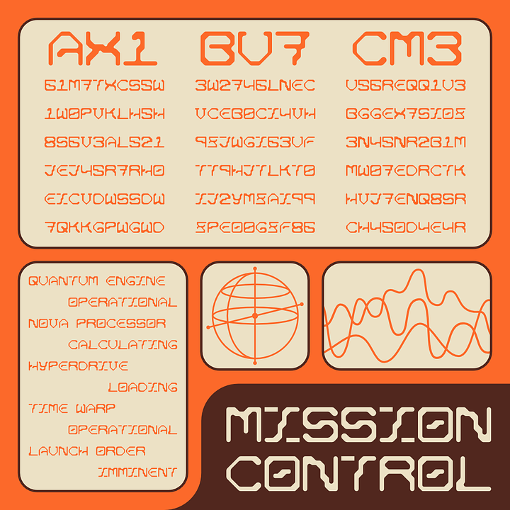
Left to right, top to bottom: Outer Space, Multivac, Phazed, Zora Hope you enjoyed this selection! Now you can vote for the next one (yes I’m reusing a theme from last month but it’s because I think it would be a fun one).


When I don’t work…
I’ve started watching Ted Lasso and while I loved season 1, I can’t help but feel disappointed by season 2. I thought the first season was very smart in how it approached the main character’s enduring positivity and even questioned its negative aspects while blending it with the small-scale drama of managing a football team (for my US readers that’s soccer). Season 2 so far feels like it almost only focuses on the interpersonal drama between the characters. And while it’s not bad, as some of the characters are going through some really interesting narrative arcs, it feels like it’s missing what made the first season so special.
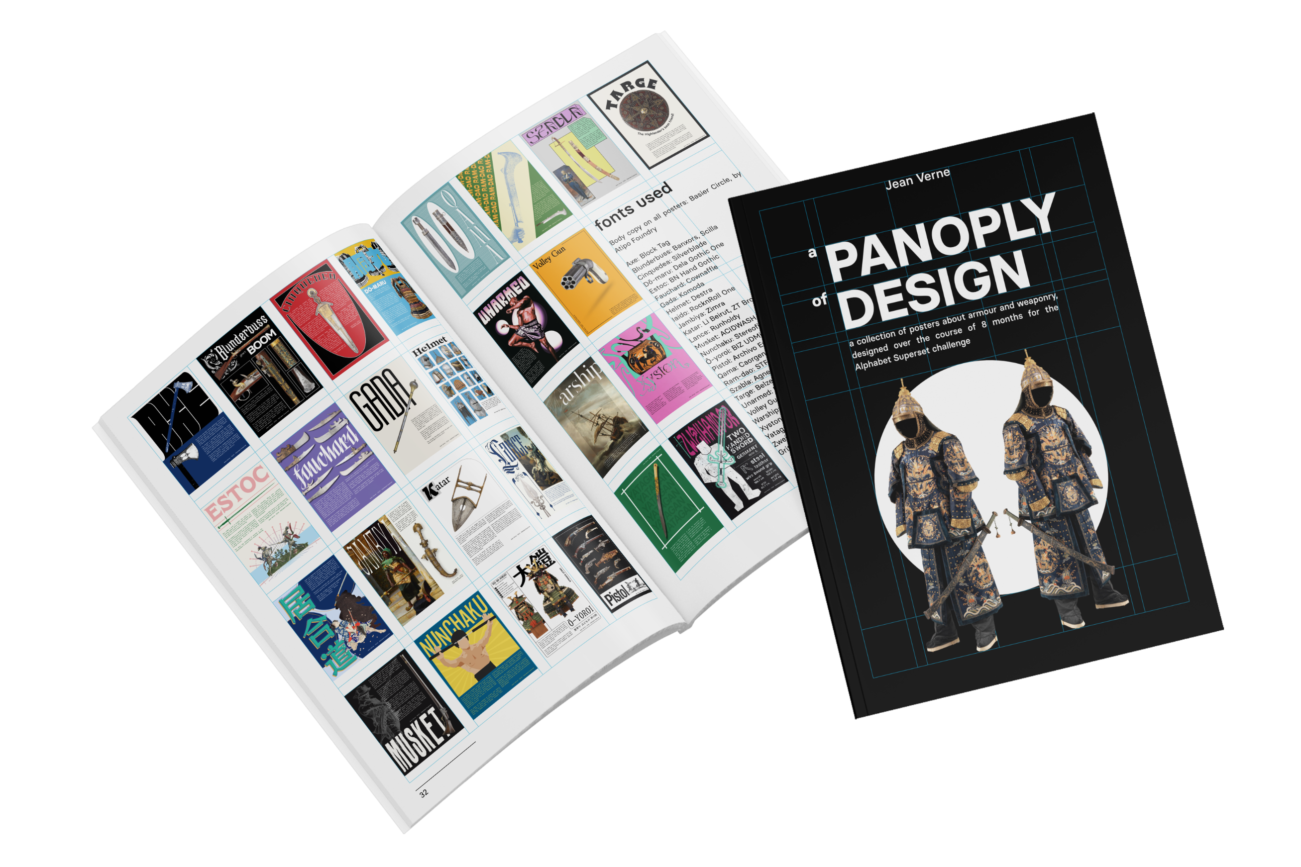
Remember those posters I was making for the Alphabet Superset? Well I finally found the time to assemble them into a zine and release the whole thing: a Panoply of Design (I can’t tell you how smart I felt when I found that title). It’s available here, it’s pay-what-you-want and I’m very happy with it. I might even print a few copies!
Thanks for reading, see you next month! (and if it’s hot where you live remember to stay hydrated)